Showing posts with label graphic design. Show all posts

Friday, April 24, 2009

Farewell to Graphics


Well, another semester has come and gone in the blink of an eye. I am legitimately sad that our time in Graphics 217 is over. I really enjoyed this class and know that I will take all that I learned with me. I am a creative advertising major, so these skills and concepts are crucial to my understanding and success in my industry. If I were to go for an interview and be asked to critique an ad (as they so often do), I will be able to impress them with my knowledge of concepts like Gestalt principles, hierarchy, continuity, perception, etc.

Let me just say that we take for granted how much practical experience we were able to get. Sure we moaned every time Danya handed out those project assignment sheets, but in the end, we were truly lucky to be able to create what we did. When selecting colleges I had finally decided on NYU over Syracuse. I visited the city campus and spoke to professors and students, and the one thing they wish that their program had was more opportunity to actually create, use the programs, craft executions instead of just the ideas behind them. I thought to myself, what is the good in that?

Even with all the stress, the loooonnnngggg office hour lines, and unnecessary lab classes (YES I AM SAYING THAT THOSE LABS SHOULD DEFINITELY NOT BE MANDATORY!!!!!!!) Professor Hedges made the class truly enjoyable and worthwhile. He has a great eye and a clear passion for what he does. All in all, I will never forget my time in this class and the valuable information and skills I have amassed.

Thursday, January 29, 2009

Tropicana gets a new look


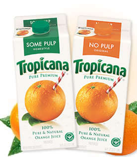
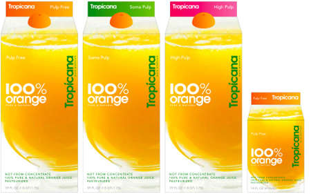
Going along with Pepsi's new design, Tropicana also has a new design, wordmark and logo. Tropicana is part of the Pepsi Company, so it looks like the company decided to do multiple redesigns. The new carton is simplistic and plain. The old design had a very recognizable picture and wordmark. My roommate and I were at Kimmel the first time we saw the new carton design. She was looking for orange juice to drink, and passed right over the Tropicana label. After realizing her mistake, she commented on how the new carton design looks very generic. I agree, it doesn't stand out much and is easy to pass over, like a generic version of orange juice. All in all, I don't think PepsiCo is doing a very good job with thier new designs. What do you think?

Friday, January 23, 2009

Oh look! Another post on typography!


What is there to say about typography that hasn't already been said?  It's one of the most overlooked yet profound methods of advertising and expression in the history of media, and as such, it seems only fair to devote at least a few blogs' worth of time and effort to this noble art.  The lectures, combined with the
Lupton reading, have made it all too clear how much of an effect typefaces and type orientation and type color and type size have played in our decision-making as consumers.  It's a job that rarely receives its due credit, choosing fonts that will catch our eye and convey meaning and manage to not overwhelm us with too much visual stimuli.

But when you think about it, and I mean really think about it, typography is one of the only things in our lives that we encounter on a regular basis.  I'm talking every single day in our nearly century-long existences.  Even
 looking around my room I am bombarded by text, be it from my Dark Knight poster or the label on the bottle of the aspirin I took last night for my headache or the label on the Obama pin on my bag or the title of my Snow Cake DVD sitting on my desk.  It's everywhere, and what's more, for some things it's universally recognized.  Take for instance a poster for one of my own personal favorite movies, Jonathan Demme's Oscar-winning picture The Silence of the Lambs, displayed above.  It's a fairly well-known image:  Jodie Foster with the death's-head moth over her lips, the title of the movie featured beneath.  We probably all recognize it right off the bat, and if you don't, you need to start watching better films.  Point is, the set-up is a pretty clear indication of the sort of picture you're about to see:  suspense-thriller, intense plot line, won't-take-your-shit characters.

Now take a look at the image I created in Photoshop.  It's the same basic idea:  Jodie Foster with the death's-head moth over her lips, the title of the movie featured beneath.  The picture is the same, the coloring is the same.  Except...oh wait, there's a small adjustment made to the words The Silence of the Lambs.  I just used a different font, but now the tone of the entire poster has gone from suspense-thriller, intense plot line, won't-take-your-shit characters to something akin to "Clarice Starling goes skipping through the meadow with Dr. Lecter in search of bunny rabbits and rainbows."  In going from a sans serif typeface to a downloaded font called Font Diner Dot Com Sparkly, the whole theme has been altered.  THAT is the power of typography.  Genius decisions can bolster sales by the millions, and mistakes have the potential to lead to marketing flops and even bankruptcy.  It is a rare form of art that can so evenly balance the incorporation of creativity with the preciseness of logical decision-making.  This is the definition of graphic design.