Showing posts with label Logos. Show all posts

Friday, March 20, 2009

Kelsey McCarthy Logo


Visual Message: My logo and stationary system is something I hope to use for the clothing company I recently began. All of the shirts that I design promote different social causes and overall just promote the idea of getting involved and engaged in society. I wanted my logo to be simple and light with an airy and youthful tone to it. Many of the shirts I design promote environmental causes and overall every decision we make as a company we keep the impact on the environment in mind. For this reason green is the only color used and the leaf is the major element of the logo. I want people to immediately connect our company with the idea of environmentally conscious and responsible. I also used the recycle symbol on both the back of my business card as well as the stationary because it says a lot about the priorities of the company. Also, I drew it by hand so it would have a sort of youthful hand drawn quality. 
Audience: The design is designed for my target market which is about 16-26 year old people who are interested in social issues and causes. Some of the shirts are clearly for women but most are designed to be unisex. 
Design Strategy: I think my design immediately communicated the fact that we are a green and environmentally aware company. Not only because the font is green but because of the use of the recycle symbol as well as the use of the earthy leaf. I also think that the shape of the leaf and the way it appears to be almost blowing highlights our laid-back nature and youthful tone. As a company we embrace movement and expect change just as a leaf does. Also we begin in one place but expect to move around to an entirely different one similar to the way a leaf blows in the wind. I stuck to simple and light fonts using only helvetica neue. I didn't want a distracting font I just wanted a clean and basic one. The shirts we design have very little text and rely mostly on pictures and designs to get the major messages across, so I wanted my logo and stationary set to be similar in the sense of not relying on the choice of font to be overbearing. On my stationary I overlapped the word "beleave" and the logo of the leaf. I just felt that it looked too rigid and boring to have them on separate ends of the page. I think that it appears better and also links the company name directly to the image of the leaf, which will hopefully further diffuse into peoples minds. Also on the envelope the veins do not appear on the small leaf, because since it was smaller I thought it looked cleaner to just have the outline of the leaf. 

Mmmm, logo.

Visual Message:

            In my design I’m hoping to portray a sense of individualism and creativity balanced with minimalism.  Renowned artist M.C. Escher, who is a longtime idol of mine, inspired the basis of my concept.  In using this reference, I am striving to create a certain tone of similarity between famous artists and myself.  I worked to simplify the original design, erasing and adjusting what had at first been highly detailed images of hands and pens.  This way the logo can be recognized and duplicated with relative ease.

Audience:

            This logo would be sent to and intended for companies that appreciate creativity and abstract concepts.  Specifically, I would hope to attract the attention of graphic arts firms and the like.

Design Strategy:

            As with the original M.C. Escher series, my logo is something of an optical illusion as it incorporates two hands that are in essence drawing themselves.  In addition to catching the eye and sticking with the audience, I’m hoping this idea relates an ambience of progressive thinking and right-brained individuality.  The style was intended to be modern, as related by the somewhat sharp, bold lines used to create the hands, pens, and sleeves.  As far as fonts are concerned, my first and primary goal was to continue with this theme of modernism…hence the use of Avenir for both my last name and my contact details.  However, in an effort to also incorporate contrast, I chose a simple yet elegant serif font for my first two initials (Berling).  Avenir is meant to be the primary typeface while Berling provides a sort of breath of fresh air, if you will.  I didn’t really change much between the three mediums; the only alteration was on the business card where I decided to make the background a very, very pale (15% transparency) of the green in the sleeves.  I did this because the card moreso than the envelope and letterhead seemed plain and uninteresting with a regular white background.

Style Sheet:

            Stationery Name: Berling, 30/36, tracking 0; Avenir, 24/28.8, tracking 0

            Stationery Address & Email: Berling, 14/16.8, tracking -10/-30

Business Card Name: Berling, 30/36, tracking 0; Avenir, 24/28.8, tracking 0

Business Card Information: Berling, 8/9.6, tracking 30/0

Sources & Influences:

            http://www.cs.nyu.edu/courses/fall03/V22.0002-003/Escher_hands_2.jpg

Extras:

            Originally I had intended to make the sleeves black, meaning that the only color in the logo would have been the peach color of the hands.  Then I used Illustrator to find a suitable complimentary color to the flesh tone.  It ended up giving me a light blue shade, but I adjusted it to a darker green because I think green is a more accurate identifier for my personality and the message I’m trying to portray.


CarlyS Logo


Visual message: My visual aesthetic favors modernity and clean lines… but with a twist. This is one of the reasons I chose to work with simple, basic shapes and simple sans serif fonts for my identity system. The yin yang connotes balance, but I wanted to alter it slightly to make it my own. This is why I added the stars instead of the traditional circles, to connect back to my personal “signature.” The added black semicircle adds to the shapes to create a sort of “C” and the curves create an “S” in order to compose an abstract representation of my initials. One might look at my logo and on first glance, simply see the yin yang, but upon further analysis, one can see the letters and the globe as well.

Audience: A dream of mine has always been to run my own international advertising boutique. Therefore, my audience will be clients and other competitive services.


Design strategy: I feel that my design aptly communicates my message; all three of them. First, there is the notion of balance in the sense that I can succeed at both the creative and managerial aspects of the advertising industry. In addition, the logo resembles a sort of globe on an axis to represent the international span. Lastly my initials and signature five-point star connect back to ME and MY identity. The Century Gothic font is sans serif, has very rounded, symmetrical features, and a modern look to it. I think the typeface and logo are not only a good fit, but keep the consistency with my resume and wordmark too. My stationary was strategically designed with a traditional letter format in mind, as there is space for a greeting, body and a closing.

Style sheet: Stationary name: Century Gothic, 18/21.6, optical kerning Stationary address and email: Century Gothic, 8.5/10.2, metrics kerning, -10 tracking Stationary phone number: Century Gothic, 9/10.8, metrics kerning, -5 tracking Business card back name: Century Gothic, 18.257/21.909, optical kerning Business card contact info: Century Gothic, 10/12, metrics kerning, 0 tracking Business card front name: Century Gothic, Carly-54.588/65.505, Shatzkin-43.67/52.404, optical kerning

Extras: I chose to use only black and white for my main logo, as it is the most versatile and “cheapest” color combination. However, this also means that my logo cold potentially work in any color combination if I so choose. As a simple test, I have added colors to my logo and perhaps someday they will represent the different departments of my agency. Finance, creative services, account services, and production.

Wednesday, March 18, 2009

Amrita Mainthia Logo


My logo rationale is on my stationery. Just click to enlarge.


Tuesday, March 17, 2009

Katie McInerney, logo identity system

The tone I am trying to convey through my logo and identity system is one of organization, cleanliness, and efficiency. My choice of typeface and logo help to convey that, but the use of color allows me to also play into my personality, which is exciting and upbeat. I hope to convey my ability to be a professional, no matter what the situation, and to also make the impression that I am far from the stereotypical rigid, boring professionals that one may find in the world. I chose my logo because I am from an island with lighthouses that serve to guide boaters into the shores; I have a strong connection to my island and it identifies me in many ways so I feel this was a good choice. I hope that, through my logo, people viewing my pieces will get the impression that I am an aid, or a beacon of light, for people; I want the viewers to understand that I am helpful no matter the circumstance. I feel all of the pieces of my design help to create a clear message about my personality as being multi-faceted.
My pieces are geared toward an audience of people in the advertising industry, specifically managers and, hopefully, higher-ups with whom I will be discussing my work. In addition, I feel that I could use this identity system with interviews; I could use the letterhead and envelope to write thank-you notes and the business card to give to the interviewer after the interview.
My logo is cleanly drawn to reflect my efficiency and professionalism; it has a double meaning as a beacon of light, which tells that I am ready to aid others. I opted for the Baskerville font in all three of my pieces because of its clarity in small fonts even though it is a serif. In addition, the serif connotes a sense of professionalism as well. I decided on the design for the business card because the clean lines and simple layout further convey my message, but, like I stated before, the color adds an exciting facet to the design. I based the other two pieces off my business card, incorporating the color red in both to show consistency, but not offensively. I know that the designs on the envelope and letterhead are to be used less as a reference, and more as just a background for writing so I didn’t want the color to be as obvious. I wanted to ensure that I would have enough space to write a letter or address an envelope, so I took into serious consideration the size of my logo on each of those pieces.
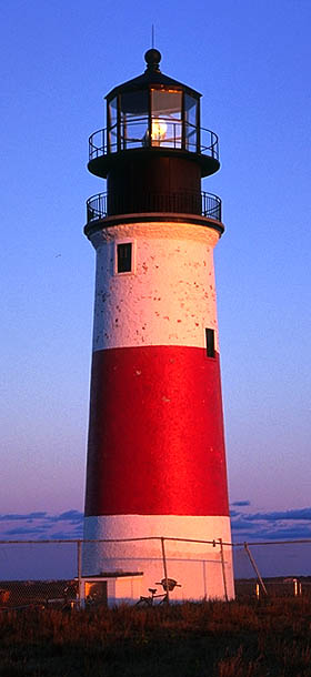
A lighthouse on Nantucket, called Sankaty Head, gave me the basis for my logo. Sankaty was the lighthouse I traced for the general shape of my logo, before I altered it.
I realized while I was creating my design that I was using a lot of black and white with some gray shades only. I didn’t mind this design, but I felt that to express my personality more I would need color, so I took the same type of red from the original lighthouse and applied it to my designs. The business card needs to stand out the most, so I put the most vibrant red there. I also incorporated my name in red on the letterhead because I feel that is the most important part of the actual piece. Red wasn’t as important for me to use in the envelope because that is something that is discarded after use anyways. I felt that the way I used the red tied the pieces together most. I struggled a lot with finding a way to connect the three and red seemed to help me a lot. I was experimenting with a bright blue, to reference the sky, but the blue was too much of an adolescent color for me and I realized the need to be more professional yet stand out. I think red does it for me.

Friday, March 6, 2009

Current Event: Watchmen

Today was the opening ofWatchmen.  I didn't get to go see it, which was my big disappointment of the week.  We've all seen the commercials for this major motion picture before:  the haunting music, the 300-tastic visual effects, the line that appears in every single trailer:  "The world will look up and shout 'Save us!'  And I'll whisper...no."  Our televisions have been a bit overloaded byWatchmen, not that I'm complaining.


It's gotten to the point where even people who aren't familiar with the graphic novel will see that Comedian's badge, the yellow smiley face with the blood spatter that looks like an arrow, and immediately recognize its reference.  In this regard, the Comedian's badge has become a logo for theWatchmen franchise.  It's taking a symbol that is generally distinguishable to mostly everyone in our culture, the "Walmart smile" so to speak, and tweaking it just a little bit to make it something entirely its own.  The blood spatter in the top left-hand corner is small and diminished by the garish yellow, so much so that if you squint it's barely noticeable.  But its presence signals a darker, more morbid twist to the happy yellow smile.  I find it to be a highly effective logo for the series, as in just a short time it's become one of the most recognizable symbols in movies today.

Thursday, January 29, 2009

Tropicana gets a new look


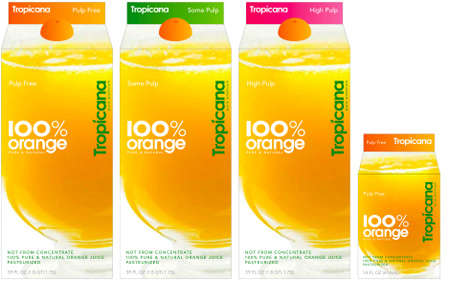
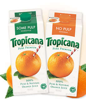
Going along with Pepsi's new design, Tropicana also has a new design, wordmark and logo. Tropicana is part of the Pepsi Company, so it looks like the company decided to do multiple redesigns. The new carton is simplistic and plain. The old design had a very recognizable picture and wordmark. My roommate and I were at Kimmel the first time we saw the new carton design. She was looking for orange juice to drink, and passed right over the Tropicana label. After realizing her mistake, she commented on how the new carton design looks very generic. I agree, it doesn't stand out much and is easy to pass over, like a generic version of orange juice. All in all, I don't think PepsiCo is doing a very good job with thier new designs. What do you think?

An Alternative Super Bowl Logo


Searching on the web for new logos, I found that The New York Times decided that there should be an alternative Super Bowl logo this year. The chosen one was a cartoon-like design by Stefan Bucher.

"The Super Bowl audience is stagnant. Any logo designed for the current target will not increase viewership. For the Super Bowl to thrive we need to tap new audiences. To this end I've designed a logo to engage the highly energetic, vigorously monetized and entirely underserved nerd segment of the viewing public by connecting the N.F.L. experience with a few of their cultural touchstones," said Bucher.
One of the cultural icons that Bucher is referring to is probably the ∑ symbol, which not only denotes the sum of a set of variables, but more importantly (in this context, at least), stands for Greek life, which is currently extremely popular among college kids (a prime audience for the Super Bowl). He might also have meant the chemistry symbol since the ones that appear in the logo represent the testosterone molecule, something connected to “manliness” and thus, “manly” sports and their respective events, such as the Super Bowl. Similarly, the triangles at the bottom represent team logos. Also, the barcode might stand for our society's ubiquitous consumerism, which is well apparent in the Super Bowl's association with advertisement. Moreover, you can take a look at the slogan in antiquated font—which could stand for something the Super Bowl definitely is—a tradition.

Friday, January 23, 2009

Selling with typography: Starbucks and Dunkin Donuts

I had no idea what to write for this blog, so I decided to take a look around the room. It took me a second before I realized the iced coffee in my hand would make a perfect topic. I was holding a grande iced coffee from Starbucks, where I had stopped before making my way back to the dorm. Why did I go to Starbucks and not Dunkin Donuts, which is also on Marshall Street and actually closer to my dorm? I do like the taste of Starbucks better, so that was the selling point for me. But is that why so many people around the world flock to a Starbucks (which isn’t difficult, seeing as there is one on every corner) instead of Dunkin Donuts? For the taste? I doubt it. However, I think the reason why is very simple.
Let’s analyze the clientele of each of the establishments. When you think Starbucks, you think celebrities with venti lattes walking through Hollywood, or extra-hot-soy-caramel-no-whip-macchiatos. Dunkin Donuts? I see the working mom on her way to work rushing through the drive-thru, or a “regulah” coffee with “cream n’ sugah.” (At least that’s the way it is in Massachusetts). It’s clear that the clientele of each company is different. The message that the respective chains are trying to convey is different, and they are attracting their type of people through their logos. They are branding their product. The logo, however, cannot be something obscure that requires a lot of detail—it needs to fit on a coffee cup. That is where typefaces come in.
When I look at the Dunkin Donuts logo, the bright colors attract me. However, the font of the text is the most important thing. The designers of this logo opted for a rounded font, which isn’t necessarily childish, but it reminds me of something a bit less serious. It is welcoming, unpretentious, and less assuming. Take a look at the Starbucks logo. The woman in the center draws allusions to mythical characters, and the sans serif, large block typeface is very serious and more sophisticated. The typefaces play to the clientele of each company. Starbucks sells a higher-priced, “fancier” type of coffee, and they have a fancier, almost more-educated type of logo. Dunkin Donuts has a less expensive, more home-y, and regular person-feel to their logo. This isn’t to say that only a certain type of person drinks each type of coffee; people should choose the caffeinated beverage that is most tasty to them. However, I’m sure that much of America is more concerned about the image of their cup than what is inside of it. Either way, (and it should be no surprise) both Starbucks and Dunkin Donuts have successfully used typefaces to sell their products across the United States and even around the world.