
 also play into my personality, which is exciting and upbeat. I hope to convey my ability to be a professional, no matter what the situation, and to also make the impression that I am far from the stereotypical rigid, boring professionals that one may find in the world. I chose my logo because I am from an island with lighthouses that serve to guide boaters into the shores; I have a strong connection to my island and it identifies me in many ways so I feel this was a good choice. I hope that, through my logo, people viewing my pieces will get the impression that I am an aid, or a beacon of light, for people; I want the viewers to understand that I am helpful no matter the circumstance. I feel all of the pieces of my design help to create a clear message about my personality as being multi-faceted.
My pieces are geared toward an audience of people in the advertising industry, specifically managers and, hopefully, higher-ups with whom I will be discussing my work. In addition, I feel that I could use this identity system with interviews; I could use the letterhead and envelope to write thank-you notes and the business card to give to the interviewer after the interview.
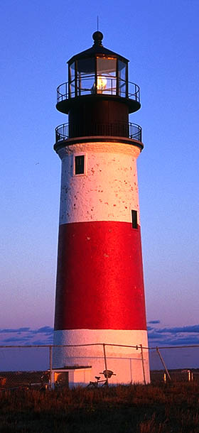
My logo is cleanly drawn to reflect my efficiency and professionalism; it has a double meaning as a beacon of light, which tells that I am ready to aid others. I opted fo
 r the Baskerville font in all three of my pieces because of its clarity in small fonts even though it is a serif. In addition, the serif connotes a sense of professionalism as well. I decided on the design for the business card because the clean lines and simple layout further convey my message, but, like I stated before, the color adds an exciting facet to the design. I based the other two pieces off my business card, incorporating the color red in both to show consistency, but not offensively. I know that the designs on the envelope and letterhead are to be used less as a reference, and more as just a background for writing so I didn’t want the color to be as obvious. I wanted to ensure that I would have enough space to write a letter or address an envelope, so I took into serious consideration the size of my logo on each of those pieces.
A lighthouse on Nantucket, called Sankaty Head, gave me the basis for my logo. Sankaty was the lighthouse I traced for the general shape of my logo, before I altered it.
I realized while I was creating my design that I was using a lot of black and w
 hite with some gray shades only. I didn’t mind this design, but I felt that to express my personality more I would need color, so I took the same type of red from the original lighthouse and applied it to my designs. The business card needs to stand out the most, so I put the most vibrant red there. I also incorporated my name in red on the letterhead because I feel that is the most important part of the actual piece. Red wasn’t as important for me to use in the envelope because that is something that is discarded after use anyways. I felt that the way I used the red tied the pieces together most. I struggled a lot with finding a way to connect the three and red seemed to help me a lot. I was experimenting with a bright blue, to reference the sky, but the blue was too much of an adolescent color for me and I realized the need to be more professional yet stand out. I think red does it for me.
3 comments:
I like that you used a personal symbol that is both dualistic in that it has a certain meaning to you and a certain meaning to the viewer. I like your envelop best for some reason. I think the lighthouse image there is the most powerful. I do sense a bit of a disconnect between envelope/business card and the letter head. It looks like you used a different text in the letterhead and incorporated color into your name. I would have tried to do this with my envelope and business card as well. Overall though, nice job!!!
I love this Katie! You're logo is so representative of New England and specifically Nantucket. Anyone who interviewed you and had this logo on a resume or letter from you would make that association with you, since being from the Island of Nantucket is such a unique quality.
I love this logo system it has a classic look and represents you well. I think it's very important to use a symbol that represents you great job!
Post a Comment