

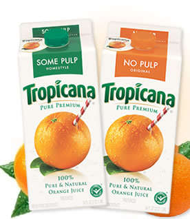
Going along with Pepsi's new design, Tropicana also has a new design, wordmark and logo. Tropicana is part of the Pepsi Company, so it looks like the company decided to do multiple redesigns. The new carton is simplistic and plain. The old design had a very recognizable picture and wordmark. My roommate and I were at Kimmel the first time we saw the new carton design. She was loo
 king for orange juice to drink, and passed right over the Tropicana label. After realizing her mistake, she commented on how the new carton design looks very generic. I agree, it doesn't stand out much and is easy to pass over, like a generic version of orange juice. All in all, I don't think PepsiCo is doing a very good job with thier new designs. What do you think?
5 comments:
Let me just start out by saying that I am an OJ fanatic. Seriously, I can't go a day without drinking a glass of orange juice, and Tropicana happens to be my brand of choice. When I went to the supermarket the other day, I felt so stupid going back and forth down the refrigerated juice section, looking for my favorite brand. However, the packaging change really confused me. I thought that it was a Wegman's imitation or something, because in my mind, Tropicana had the oranges with the little straws on it. It made the drinker feel that the juice was the ultimate fresh, like you were drinking straight from the fruit itself. The newer and more modern design, besides color, has little to do with the company's image, and that is why I don't particularly care for it. ALso, it made me look stupid in public, so I really don't care for it ;)
I agree. The straw in the orange was so iconic. I actually tried to recreate it when was little lol. I see what they're trying to go for – modern and minimalist, but it just comes off as generic. And when I think generic I think lower quality. Bad move.
(Sorry, deleted my last comment on accident.)
I am going to have to disagree. Clearly, Pepsi feels the need to revitalize their logo, and that is what they are doing. I don't have any real strong opinion on the logo. I too love orange juice and I drink Tropicana all the time. In fact, I got nervous when I was at the supermarket over Winter Break--it seemed that they were running out of Tropicana. It took me more than one trip to the store to figure out that no, in fact, the store wasn't running out of Tropicana; that was their new logo. I do think, however, that the design they have come up with is sleek and will be effective. I don't think people will stop drinking Tropicana because of it. I feel that people may not like it because we are creatures of habit, and no one likes change. I just don't think this is a bad logo. It seems like a good idea for Tropicana to revitalize their image and make orange juice more alluring, seeing as it is a healthy beverage and that is what this country needs-more health, and less obesity.
I actually like the new design. I think it's cleaner. It's more about the purity of the orange juice. The way that the entire carton essentially is the juice emphasizes the actual product. I will admit, however, that when I was at Wegmans at the start of this semester I did initially pass over the Tropicana as well. I think it is hard to rank to two designs as one better than the other, because they are so different. Perhaps as there is an increased emphasis on eating healthfully they are trying to highlight the product itself. The text is simpler, and the design is very basic, but at least for me it works.
Post a Comment