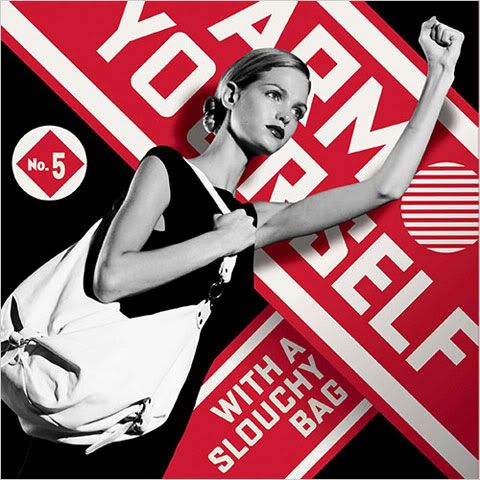
Saks Fifth Avenue recently hired Shepard Fairey, the artist known for creating Obama's iconic Hope poster, to design its catalog covers and shopping bags. The campaign is inspired by 1920s Communist propaganda, using bold graphics and a red, white and black color scheme.

“What we do every day, really, is propaganda,” said Terron E. Schaefer, the senior vice president for marketing at Saks.

While I don't think the "propaganda" will be successful in the current economic climate, Fairey's designs make for some eye-catching pop art.


5 comments:
WOW! I love this new modern design to the bags. The black, white and red along with the bold graphics really make the bag stand out. When new graphic images are introduced to a company, the face of the company changes. I like this new look of SAKS, very different, very modern.
Overall, I think it is really risky to base the new look on Communism. I don't know if the generation that shops at Saks finds the intended humor in it because they lived through the Red Scare and Cold War. I know it is poking fun at propaganda, but I'm just not sure if everyone will think it appropriate. Graphically speaking, I applaud the designer's use of bold shapes and modern appeal. Saks is known for it's classic black and white color combination, but the red really sets this new campaign apart from previous ones. I mean, it certainly commands attention.
I agree that linking itself to Communism might be risky for Saks. On another note, I was looking at some of their catalog covers and I noticed that some use only bold colors and images and some use only neutral/pastel colors and more subtle images. I feel that this makes it hard to compare the example given here to past examples.
Well, this will certainly stand out. This design is pretty kick-ass, if you ask me. I don't know if it's appropriate or not, but I like the colors and the typography. It stands out. Maybe it's just me, but I cannot recall a single definitive ad or marketing campaign for Saks. This, however, will stand out and if I saw this on a bag walking down the street. I feel this is a new take on transferring the bold fashion they have to their marketing.
Post a Comment