


The article I chose to recreate was from New York Magazine. New York Magazine is a trendy magazine that comes out weekly. The magazine regularly features articles dealing with current events but also entertainment news as well. It’s intended readership is for New Yorkers who are interested in New York City life and pop culture. Readers could be any age who fit this criteria.
Magazine Visual Identity
Because the magazine covers so many various topics in it, I wanted to make sure to convey a sense of organization even though it is so broad. I will explain this more when I discuss the document’s grid. However, I purposely organized the title, cover teaser, text, photographs and pull quotes on a 180 degree line because I think this helps make the magazine look organized as a whole. If the magazine was only about entertainment or had a more focused topic then I think I could have gone crazier with rotated texts or photographs, but not in this case.
Article Visual Identity
I wanted to show the reader that this was a fun article. It is supposed to attract Sex & the City fans, however the title also could be intriguing to people who are not as familiar with the show and movie. The casual script type and bold pull quotes help to convey that. Also, the photographs are interesting and fun to convey that the article is not supposed to be very serious.
Article Design Strategy
The initial impression I wanted to give the reader was that this was not just another article on New York City, Sarah Jessica Parker or Sex & the City. I used the script text to attract the reader to the word “Sex”, but also to show that the article was fun. I used the large photograph of New York City, Sarah Jessica Parker and the different color text for her name to let the reader know the article tied all three together. I wanted to use a structured text for the rest of the headline and for the pull quotes to imitate the structure of the New York City buildings on the feature spread. However I continued to use the Wendy text for the drop cap and the title of the sidebar so that I could continue to show the article was fun.
Style Sheet
Opening Spread Headline: Kepler Std Medium Semicondensed, 90/95, metrics kerning, tracking -60. Wendy LP Std, 220/146, metrics kerning, tracking 0.
Deck: Kepler Std Medium Semicondensed, 26/28, metrics kerning, tracking 0.
Body Copy: Garamond 3 Std, 11/13.2, metrics kerning, tracking 0.
Pull Quote: Kepler Std Bold Condensed, 27/27, metrics kerning, tracking 0.
Sidebar Text: Antique Olive Std, 8/9.6, metrics kerning, tracking 0.
Caption Text: Antique Olive Std, 7/8.4, metrics kerning, tracking 0.
Document Grid
As I explained earlier, I chose to use a grid and stick very close to it with everything on a 180 degree angle. I chose to use two columns because this article is fun and about entertainment, and not really very serious or like a news article. I think if I had used three columns, the article would have been more of a news article and seem cluttered. I chose wide columns with a width of 21p10 because there was still a lot of text to give to the reader, but I felt the wide columns were more appealing to the reader.
Sources
Feature Spread photograph of Sarah Jessica Parker:
http://c-photo.i-part.com.tw/n1v1/3/1/4/0/970413/photo/book83/12140398038.jpeg
Feature Spread photograph of New York City: http://eksith.files.wordpress.com/2008/08/chrysler_building_midtown_manhattan_new_york_city_1932.jpg
Sarah Jessica Parker in Wedding Dress: http://cm1.theinsider.com/media/0/378/58/sarah_jessica_parker_is_sorry_for_the_black_wedding_dress_decision_main_10231.0.0.0x0.460x692.jpeg
Sarah Jessica Parker on the phone:
Cynthia Nixon:
http://lunarsoul.files.wordpress.com/2008/06/cynthia-nixon_l.jpg
Kristin Davis:
http://www.accesshollywood.com/content/images/23/230x306/23450_kristin-davis.jpg
Kim Cattrall:
http://maxdunbar.files.wordpress.com/2009/02/kim_cattrall.jpg
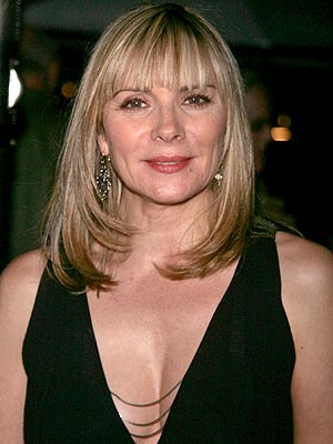
Extras
I chose to use the gold theme for the entire article not only because it was aesthetically appealing, but also because the article talks about how the television show Sex & the City makes New York City look much richer and more glamorous than Sarah Jessica Parker grew up in. She discusses this in the article.
3 comments:
I quite like how you chose the gold theme for your spread; I think it was an interesting, risky, but ultimately successful deviation from the colors normally associated with Sex & The City. I'm a fan of your layout as well, as it's clear and concise and relates all the necessary information without being straining on the eyes. Good work!
I love the colors you used and your overall design. If this was a real magazine I would definitely buy it.
I really like the way you put the light background of city building behind the title of the magazine. Obviously the show is as much about the city as it is about the women that live there and I think you really addressed that well. I also like the way you ties in the gold of SJP's hair and feature photo outfit into your entire spread. I REALLY like your sidebar. I think it's nice to address the other characters and give them some attention in the article, since they are obviously a huge part of the series/movie. You type faces are cool especially on your title page I like the mixing of fonts, it kind of perfectly represents the way Carrie was known for her mixing and matching of fashions. I really like your spread. Great job!
Post a Comment